In this article we will talk about what makes clash royal one of the highest grossing and addictive mobile games with the best user experience.
Home Screen
Reward Users the moment they open your app/website
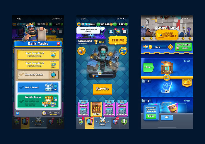
Home screen of clash royale is amazing, it has lots of colors, sparlking, cool visuals but the most primary area of focus here is rewards. The moment you open the game, it bombards you with rewards.
Combining Colors & Motion Designs to grab attention
They not only highlight their rewards through colors but also with motion design. Contrast helps in highlighting and emphasizing the area you want your users to focus at but at the same time adding motion design to it will attract much more attention from the users.

It is like a combination of chocolate ice cream and choco chips. And the best part is you cannot miss this, the moment you open this game your attention will be there, and what is there? The rewards.

Key Points
Adding UI motions to elements can also work on elements with a good contrast grabs more attention of the user than the normal use of contrast/emphasis itself.
Reward Users Now & Show Reward for Later
Out of everything in the home screen there are two primary main elements, the biggest one is “claim”. It is a type of reward the game gives you because you have opened it today.
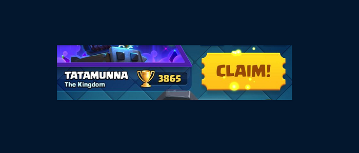
The game wants to give you a dopamine boost only because you have opened the game today so that you keep coming back. Yes you are right, you are getting a reward without doing any effort. Further more when you open the “claim section”, hey guess what?
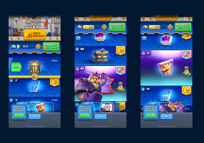
It’s not just one reward but a series of reward you will get right now, and tomorrow, and day after tomorrow if you keep playing this game. Isn’t that exciting?
The game uses the same design pattern, combination of motion and contrast on “Claim button and the reward”
What I am trying to tell you that if you show users, the benefits (reward) of opening this game, and also show them the potential number of rewards they might get if they open it again.
Upcoming rewards creates a psychological effect on users to open it again next time for the potential reward.
Game Pass — More Rewards — More Revenue
New users do not really understand the important of pass right now, but don’t worry, right now even the game doesn’t wants you to know the importance of it. It will bring the importance of “Pass” everywhere you play, and little by little shows you the importance of it. You don’t really know what it does or doesn’t.

Surely from this page it also shows you that if you had the pass, you might be getting more rewards then you generally get.
Influence the Revenue model features everywhere in your Platform little by little, to create a repetitive subconscious importance
After all everybody wants more good stuff. And the game just put a price to it.
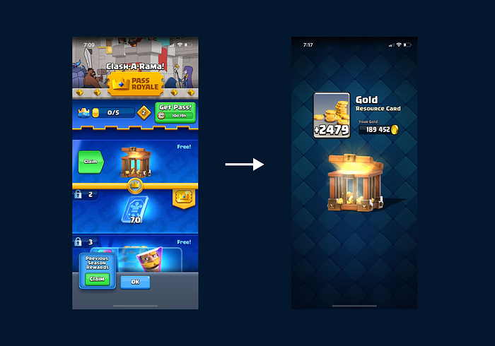
Anyway, let’s take the reward. An amazing animation brightens your eyes, with an amazing sound effects. It creates a feeling of joy and winning, unlocking something precious. Wow! it is an amazing feeling.
Let’s get back
Different Variations of Rewards
Oh guess what? I have another reward right here, let’s just also open it now. The game keeps giving you reward. Although it is meaningless in the beginning, but what’s wrong in having it. Right?
Reward for your Efforts (Sence of Achievement)

Ah so the game shows you, that it is not just giving you reward without doing anything, but also for the task you have completed. Here the game gives a different variation of reward + shows you the potential rewards that you might get if you keep completing the task. Interesting, right?
Surprising Users from Little Element to a Giant Reward

In the picture above there’s another little thing popping up right here. The last moving emphasis element of the screen, if you open it then. Another giant reward box comes, wow!!. (another……variation….of reward).
User feels like “wow I have gotten so many good things today” and brain says “I am going play it again, i have so much dopamine rush in just 1 minute of the game”
But this little thing is not a normal casket, when you open on, Bravoo!! Sooo much rewards my brain cannot even comprehend, right now I have just gotten so many things with so less effort. Another psychological phenomenon occurs, when human beings are given something for free without asking anything in return, the brain automatically wants to give back something, in this case “It’s your time”.

Connecting your Time and Effort with Big Rewards
It says if you keep increasing your king level, which is the hardest thing to do in a game and takes a lot of time. It will give you another reward like this. Here the game is taking your time and giving you rewards, very simple agreement.
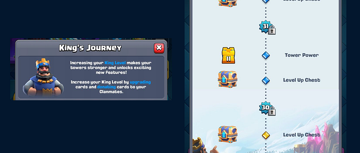
Now since the game has given you so much, now give the game your time.
A Mystery Reward timer to make you come back
Now after opening all the rewards you had, the eyes goes to the tertiary elements, “chests” It just pops up with a unique purple color, showing you a potential royalty that you might achieve, purple is also a color of mystery. The button says “start unlock 90min”. Wow now the game played another trick with me, it also gave me a time limit to come back to the game and see what is inside this chest.
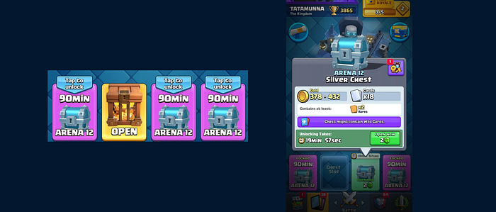
Giving a potential information to the users to indicate them that they will get something positive yet not known.
This creates even more excitement for the user to come back to the game, not today but within 90 minutes.
Till now the game has given Users many kinds of reward.
- A very big unknown Reward chest which has connected me with a character, a sense of belonging (but takes time and effort to get)
- Definitive Reward for just opening the game, and potential known rewards if i open it and play the upcoming days.
- An unknown reward chest with a lot of coins, and a potential unknown reward chest that will open in a definitive time.
- A different version of reward to completing tasks, and potential unknown rewards if i keep completing the tasks.
Wow! till now it has been a journey of so much dopamine rush. This automatically gives a positive image to me for this game.
The game’s first impression is the last impression, and it has been very successful in creating a good first impression for users.
And lastly, the main button which is the most prominent after taking all the rewards. “Battle” the core game play, where you will do the real action. Before clicking this button I just want to tell you that you’ve halfway been addicted to this game.
Lesson Learned
You can use these techniques applied by this amazing game, to help boost your user Engagement and Retention. A simple concept of reward has such a dramatic impact on the users is unimaginable. There can be multiple creative ways we can use the power of rewards to create a fun and addictive application, website and anything you can imagine. Lastly we need to have different versions of rewards, with definitive and unknown outcome of what kind of reward we will get and at what time we will get.
Next Part Coming soon…. Adios
